In the
production of my media product I focused on taking inspiration from real
successful products, abiding with the sense of realism I wanted to create. My
inspiration came from the magazine ‘Q’. I found this magazine to fit the style
I wanted to portray with a different array of styles shown in each issue. One
front cover in particular caught my attention and inspired my ‘mock up’ front
cover and the images I took for my final production.


 These
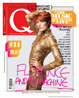
are the two covers that inspired my mock up and final piece. The image of
Florence Welch on the right was something I felt I wanted to portray as she
takes up the full cover of the magazine, the image is also powerful. The idea
of using a simpler image abides with me wanting to create a simplistic front
cover with interesting stories inside.
The cover on the top has the title spread across the page which I liked
as it adds more of an edge to what otherwise could have been quite a boring
front cover. Under these two images is my final draft of my mock up piece. As you can
see I have used a picture of Florence, this keeping with the idea of a soft and
simple facing image. My title is also in keeping with the style of the
magazine, with all focus being on the top left corner with a tag line sitting
beneath it.
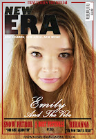
To the right is my final front cover, i have kept a majority of the components displayed in my original mock up draft. The change of the
title to ‘Emily and The Vibe’ from ‘Florence and The Machine’ adds once again
to the realism of the piece by showing that I am talking about a 'real' original band. To abide with the conventions of a real magazine I also
needed to add things such as bar codes prices, the magazine website and other
things. The main cover image is looking directly into the camera
creating a direct mode of address with the readers. This is in keeping with my
research and also suggests a connection between who the audience are reading
about and the readers themselves. The sell lines on the cover consist of quotes and the
featuring artists names this it itself could sell the magazine to the target
audience. Due to them possibly being interested in the artists. I have also
used the header at the top which states ‘FIRST EDITION VIBE SPECIAL’ this is
enticing to the audience due to it being the first edition making it an
exclusive. From my research I found that there is a different variety
of font sizes and font style used in magazines such as Q and KERRANG. There are also mixes of quotes displayed on
the various covers I looked at. I took this into consideration when producing my
work, and used upper case fonts along with a different variety of styles. The colors scheme as mentioned before is black and red this may seem dominantly
male however the different styles of font also contribute to pleasing a female
audience making my magazine appealing to both genders.
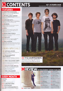
 As
you can see here I have taken a lot of inspiration from the Q contents. I liked
the layout and overall concepts of the page. The images are clear and link to
what is written under each title, for example in my piece the picture captioned
’37.’ links to the regulars section. I thought this was a good idea as it makes
the magazine less plain, and also lets the readers know who they will be
reading about. The content is in keeping with the colour scheme seen on the
front cover, which keeps up with the consistency of the magazine making it more
realistic. All images I have shown on both the double page spread and contents
have direct eye contact with the camera, this once again creating the
connection between the audience and artist.
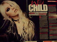
The image displayed on the left is the DPS I took my inspiration from; this
is contrasting from the other parts of the magazine. This is due to me taking
the double page spread from Kerrang magazine rather than Q's. I had this idea due to me liking
the layout of both Q’S front page and contents page but liking the concepts of
Kerrang’s double page spreads. I find these more eye catching and interesting
to look at, I also found that the lay out was more efficient and would be more
pleasing for the readers. Once again the colors are in keeping with the themes of the magazine once again adding once
again to the realism.
The uses of different fonts and the bold colors and writing
make the article look more interesting. It also makes the audience think that
they are reading something that they cannot see anywhere else. With these ideas
I have stayed with the conventions of a normal magazine with trying to draw in
the audience. I have tried to make my piece as realistic as possible so the
target audience get the feeling that they are reading a real magazine. Which is
what wanted to achieve in my media production. The layout of the spread also
abides with the idea that English readers tend to read from left to right. I
also placed my central image entirely on one side of the page, this making it a
dominant image of the page. This type of image appeals to my audience due to
the fashion choice and stance of the artist, making it look young and ‘in’ with
age group I am aiming for.


No comments:
Post a Comment